




Harpoon IPA – Checking Out The New Label In Person
 Story by:
MyBeer Buzz
Story by:
MyBeer Buzz
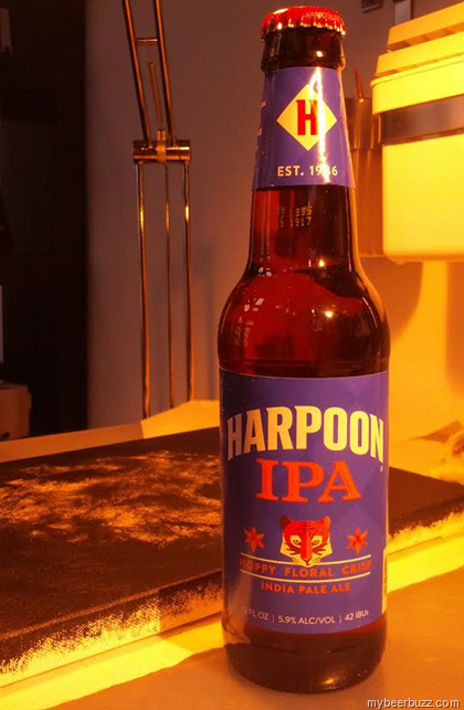
 We brought you an early peek at the new packaging for Harpoon IPA and we even followed up with the official press release, but here’s nothing like seeing the new label in the wild. Harpoon IPA is a classic India Pale Ale and a beer that I cut my early craft beer teeth on. IPA’s weren’t common in he mid-1990’s when I first started learning more about good beer, and I’ll always remember how much I enjoyed my first sip of Harpoon IPA.
Harpoon IPA began as a summer seasonal in 1993 and it remains a classic hoppy and drinkable beer even when it’s compared to modern-day IPA recipes. Jump forward to 2015 and as they begin to celebrate their 30th Anniversary, Harpoon is giving Harpoon IPA (and their other beers) a new look. 
The label is a bold blue color with a subtle blue checked background and a prominent tiger and lilies in the center. The color theme remains blue over orange with a new arched and prominent “Harpoon” logo. The labels all feature taste descriptors above the style and with Harpoon IPA it accurately reads “Hoppy Floral Crisp.”
This is the first beer to receive the overhaul (cans and bottles) and it will be followed by Take 5 Session IPA and Harpoon’s 2016 summer seasonal. The goal is to have the entire lineup overhauled by the end of 2016 so stay tuned for more. 
We think the bottle looks great, and here’s a sneak peek (above) at the “corn hole” packaging coming for Take 5 Session IPA.
A big thank you to everyone at Harpoon for giving me an early hands-on peek at the new Harpoon IPA and an even bigger thank you for sending me a fresh Harpoon IPA to enjoy. Cheers to classic beers and soon to be classic packaging.



Comments 0
No Readers' Pick yet.