





What Beer Branding and Casino Game Design Have in Common
 Story by:
Guest Contributors
Story by:
Guest Contributors
Good design frequently just has a split second to convey itself. Before we read a word of copy, the use of a logo, the combination of the colors, the font face, or one illustrative piece of copy can tell us a lot. This is the case in significantly different sectors. It’s the same few basic design questions that remain remarkably the same. Which is the most important, first? What information do you want to print out more than once? How much personality does it take for it to start to look like it has a lot going on? Two amusing places to begin to answer those questions are beer packaging and the scene in the art of casinos. Their spaces are completely different, but sometimes the same ideas are implemented in their thinking style visually.
Visual Identity Starts Before Anyone Reads The Name.
Strong visual identity works almost like recognition at a distance. You notice the shape, colors, typography, or composition first, then the name catches up. That principle applies across digital products, entertainment, fashion, publishing, and countless other fields. Betinia New Jersey, for instance, uses a defined digital visual identity across its interface, with recurring typography, color choices, imagery, and layout helping different sections feel part of the same environment.
This is the less glamorous side of branding that designers obsess over. Consistency matters. A logo can be beautifully drawn, but if every surrounding element seems to belong to another visual language, the identity starts to wobble. The strongest systems give designers some freedom while keeping a few rules fixed. Certain colors return. Type behaves in predictable ways. Images share a mood. Spacing feels familiar. You may not consciously notice any of this. That’s usually the point.
A Beer Can Has Only Seconds To Introduce Itself.
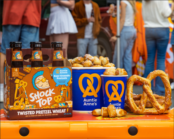
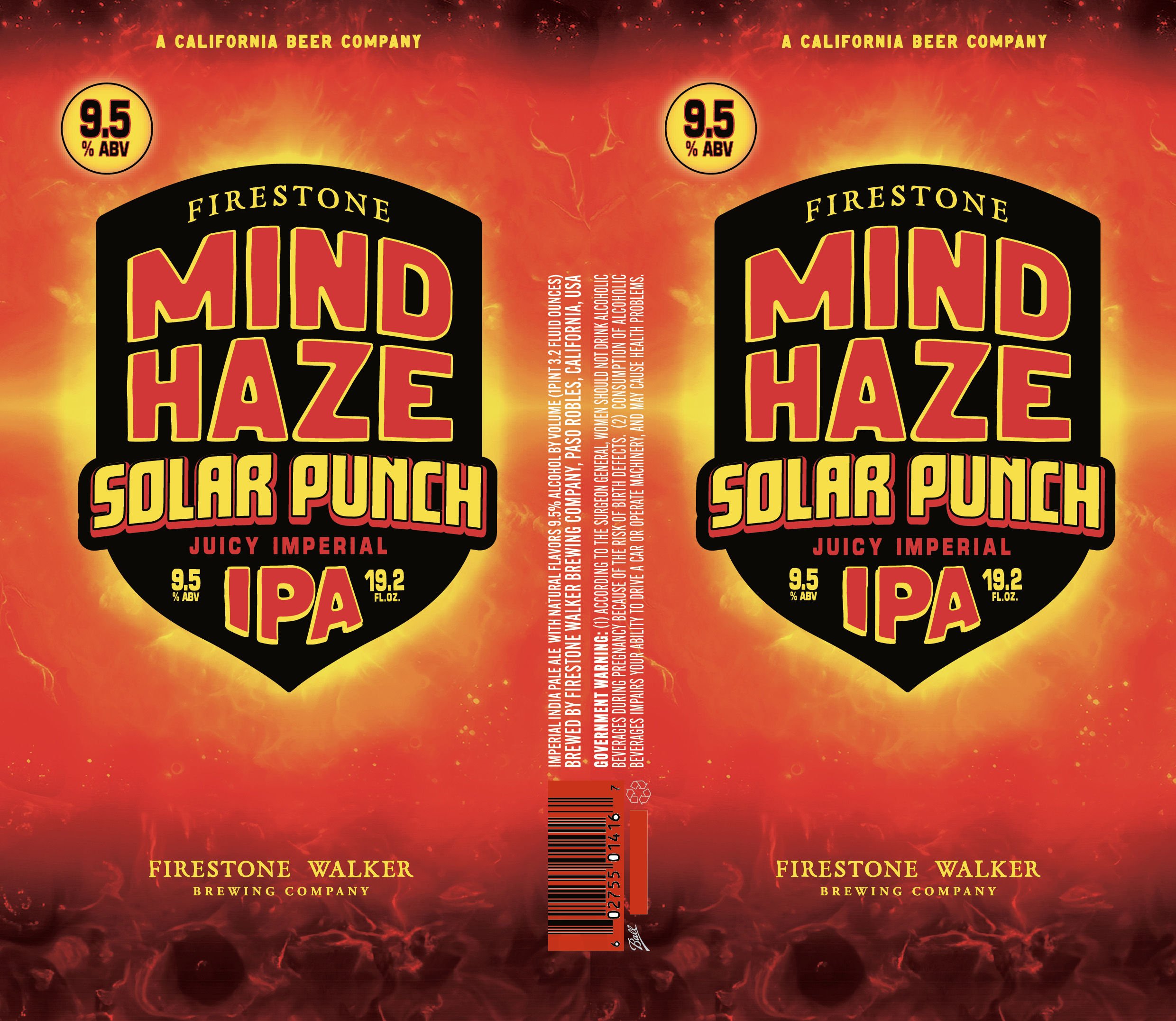
Beer packaging faces a rather unforgiving design test: the cooler. Dozens of cans may sit inches apart, each competing for a little attention. A customer might first register a brewery name, dominant color, illustration, or beer style. If every element screams at once, though, the label can become harder to understand rather than easier. That’s why visual hierarchy matters so much.
One element should usually lead. Maybe it’s a giant wordmark. Maybe it’s a curious character staring back from the can. Maybe the label relies on a remarkably simple block of color. Then the supporting information can do its job without fighting for the spotlight. It sounds obvious once you say it. In practice, knowing what not to emphasize is one of the harder parts of commercial design.
Themes Need Rules, Or They Become Costumes.
A strong theme can give a product instant character. Push it too far, and things get messy. Imagine a brewery building a series around old science-fiction paperbacks. One release has a robot. Another uses a lunar landscape. A third gets a wonderfully ridiculous space monster. The illustrations can change while the visual system stays recognizable. The same type family might return. The brewery mark sits in a familiar position. Borders, spacing, and illustration style hold everything together.
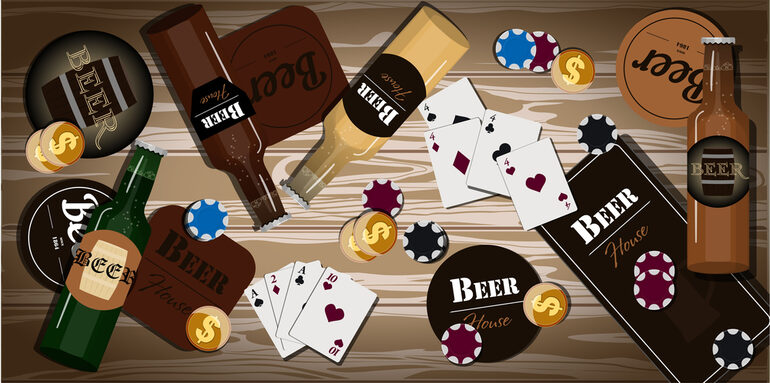
Game artwork uses a similar creative discipline. Characters, symbols, scenery, and interface elements may change, but a coherent title usually gives them one shared visual language. There’s a temptation here to keep adding things. Another glow. Another texture. Bigger lettering. One more badge. Then suddenly the design is yelling. Sometimes a strange mascot and a great typeface really are enough.
The Smartest Decision May Be What Gets Removed.
Beer branding and game design eventually arrive at the same basic creative problem: attention is limited. Designers have to decide what deserves to be noticed first, what can wait, and what probably doesn’t need to be there at all. That hierarchy gives a beer label breathing room. It also helps a game screen communicate without turning into visual noise. Great design often looks strangely inevitable when it’s finished. Of course that image belongs there. Of course the title has that size. Of course the space needs to stay empty.
Getting to that point is rarely so obvious. And perhaps that’s the most interesting connection between these very different design disciplines. A memorable identity isn’t always created by adding another clever idea. Quite often, it appears when somebody finally has the nerve to remove one, much like the clean, intentional design of a real casino, where simplicity can make an experience more memorable.


Comments 0
No Readers' Pick yet.